
A typical geostatistical analysis will be conducted in the dataset, with the following objectives: (a) describe the patterns of spatial dependence of heavy metals and relate them to the distribution of potential sources, such as rock types and human activities; (b) Build probabilistic models of the spatial distribution of heavy metals in the region; (c) Estimate the metal concentrations at locations; (d) Identify the most critical areas and (e) Assess the spatial uncertainty of the results.
About the dataset
The Jura dataset, comprising of 359 spatially distributed points, is utilized in this project. This dataset contains information on the concentration of seven heavy metals in the topsoil of the Jura mountains in Switzerland, supplemented by categorical information about the study area from geologic and land use maps. The dataset exhibits three typical characteristics of earth science datasets: (a) spatial auto- and cross-correlation of data; (b) joint involvement of multiple attributes in the analysis; and (c) incorporation of both primary and secondary data.
The training dataset comprises 259 data points, which are distributed across an area of approximately 1340 hectares at regular intervals of 250 meters, as illustrated in Figure 1. Notably, certain regions exhibit a higher density of sampling, exhibiting an irregular horizontal distribution ranging from 20 to 40 meters. This observation underscores the intricate and heterogeneous nature of the sample distribution in the field and emphasizes the significance of declustering in comprehending the spatial distribution of the variables of interest.
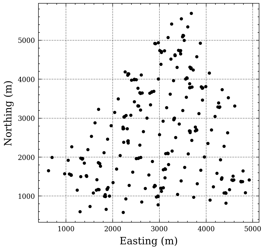 Figure 1. Jura dataset samples.
Statistics regarding the dataset
In this chapter, our main concern is to first, understand the distribution of categorical data, and second, to understand how the heavy metals concentrations are spread.
Land use is a categorical variable that describes the different ways in which land is used in the region, such as forest, pasture, meadow areas and tillage. Rock type, on the other hand, is a categorical variable that describes the different types of geological formations found in the region. Understanding the distribution of these variables is essential for various fields, including ecology, geology, and urban planning, as it can help identify areas that are susceptible to certain environmental issues, such as erosion or soil degradation, and can aid in decision-making processes related to land use management.
| Land use | Frequency (%) | Rock type | Frequency (%) | |
|---|---|---|---|---|
| Forest | 12.74% | Argovian | 20.46% | |
| Pasture | 21.62% | Kimmeridgian | 32.81% | |
| Meadow | 63.70% | Portlandian | 1.15% | |
| Tillage | 1.93% | Quaternary | 21.23% | |
| Sequanian | 24.32% |
The table presented offers a comprehensive summary of the land use categories and stratigraphic data in the research area, including their corresponding sample proportions. The majority of the sampled locations are categorized as permanent grassland, with approximately 63.7% and 21.6% being grazed and cut for hay twice annually, respectively. A small percentage of locations (~2%) are designated for cultivation, while the remaining areas are covered by forests. Regarding stratigraphy, the Portlandian formation has the least representation, accounting for only about 1% of the samples, while the other formations are represented at approximately 25% each.
After scrutinizing the joint frequencies of land use categories and stratigraphic data, it is evident that Kimmeridgian rocks are preferred by forests, whereas pastures are predominantly located on Sequanian rocks. Conversely, meadow and tillage categories exhibit an equitable distribution across all geological formations, except for Portlandian rocks.
| Forest | Meadow | Pasture | Tillage | |
|---|---|---|---|---|
| Argovian | 2.70% | 15.05% | 2.31% | 0.38% |
| Kimmeridgian | 8.49% | 16.98% | 6.94% | 0.38% |
| Portlandian | 0.38% | 0.38% | 0.38% | 0.0% |
| Quaternary | 0.0% | 18.53% | 2.31% | 0.38% |
| Sequanian | 1.15% | 12.74% | 9.65% | 0.77% |
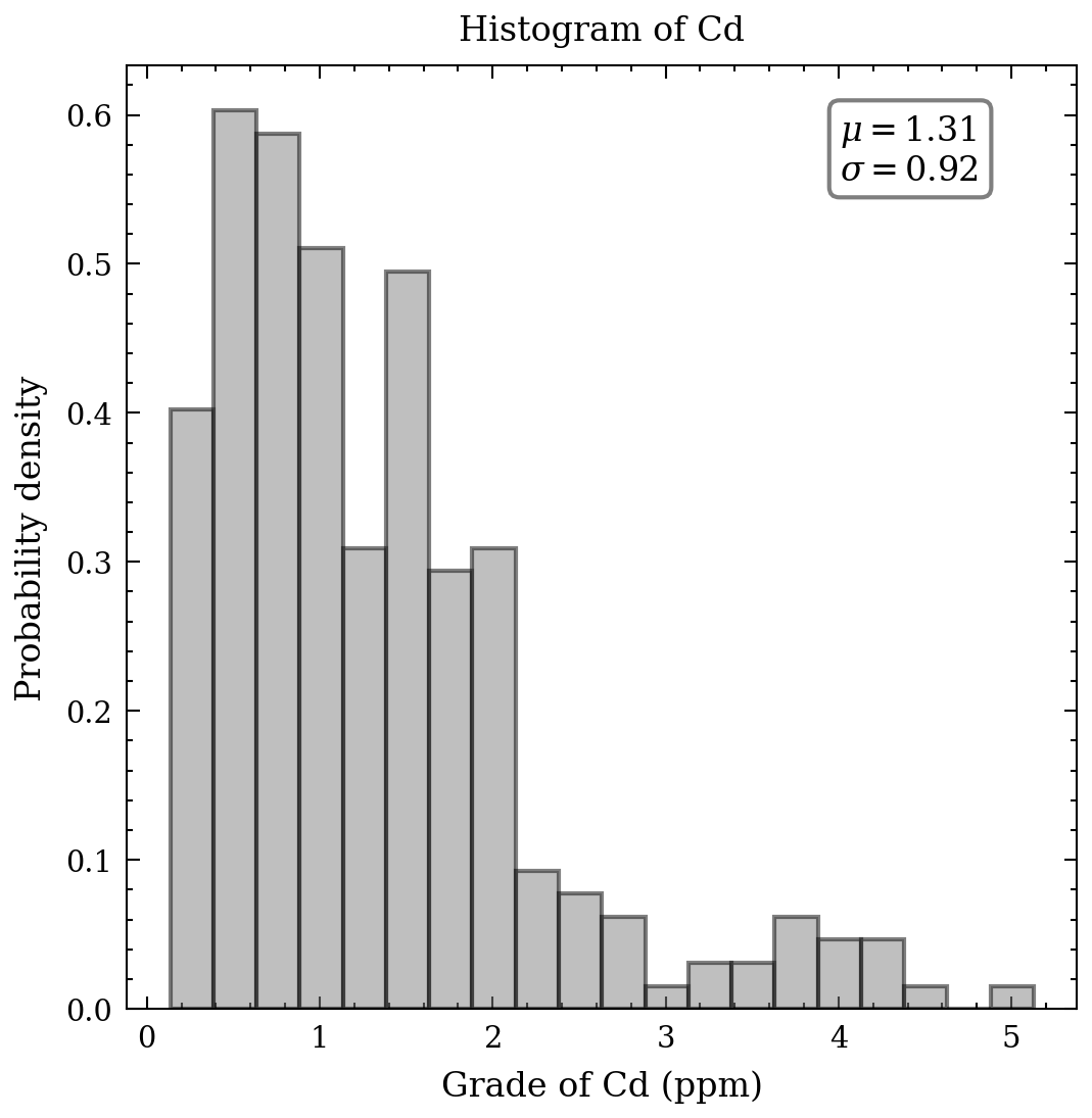
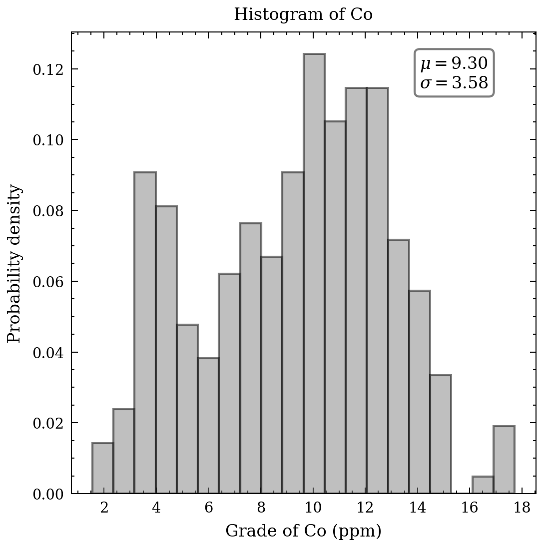
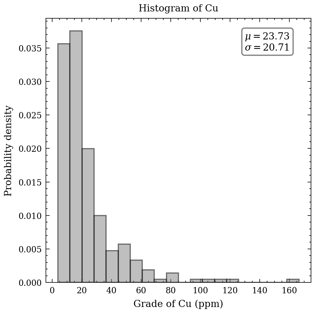
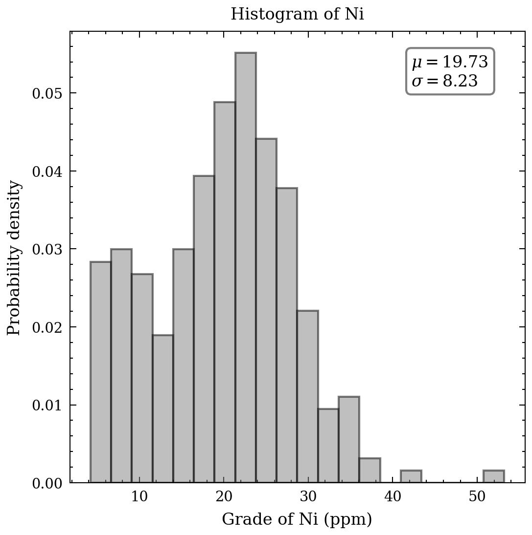
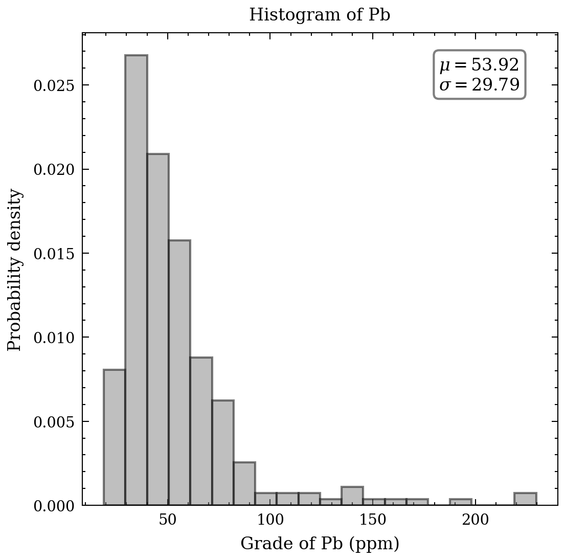
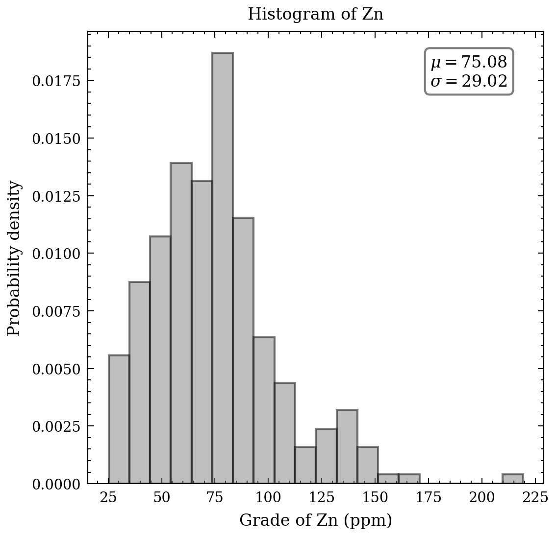
With respect to the continuous data, an appropriate tool to comprehend the distribution, means, and standard deviation of the heavy metals is a histogram. Figure 2 presents seven histograms, each displaying the metal concentrations in parts per million. The histograms of cd, Cu, Pb, and Zn exhibit elongated upper tails, revealing the existence of a few high concentrations. In contrast, the remaining histograms demonstrate relative symmetry, except for the bimodal distribution of cobalt values.
 </div>
 Figure 2. Histograms of heavy metals.
The following graphs display the cumulative distributions of metal concentrations. The Swiss Federal Office of Environment, Forests and Landscape has defined a tolerable maximum for healthy soil, which is represented by the red dashed line for each metal. The proportion of data exceeding these critical thresholds is provided at the top of each graph. Notably, cadmium and lead exhibit large percentages exceeding the threshold, up to 65% and 50%, respectively. The other metals show smaller percentages but are still of concern, including copper, nickel, and zinc. Given the scope of this article, I will limit the focus to the 2-3 most contaminated metals, cadmium and lead, and cooper as a step-by-step approach is necessary.
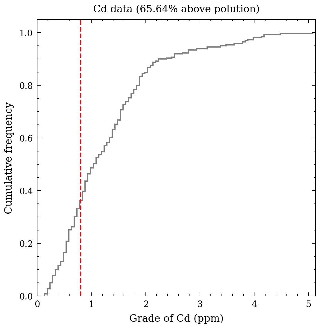 Figure 3. Cumulative histogram for cadmium.
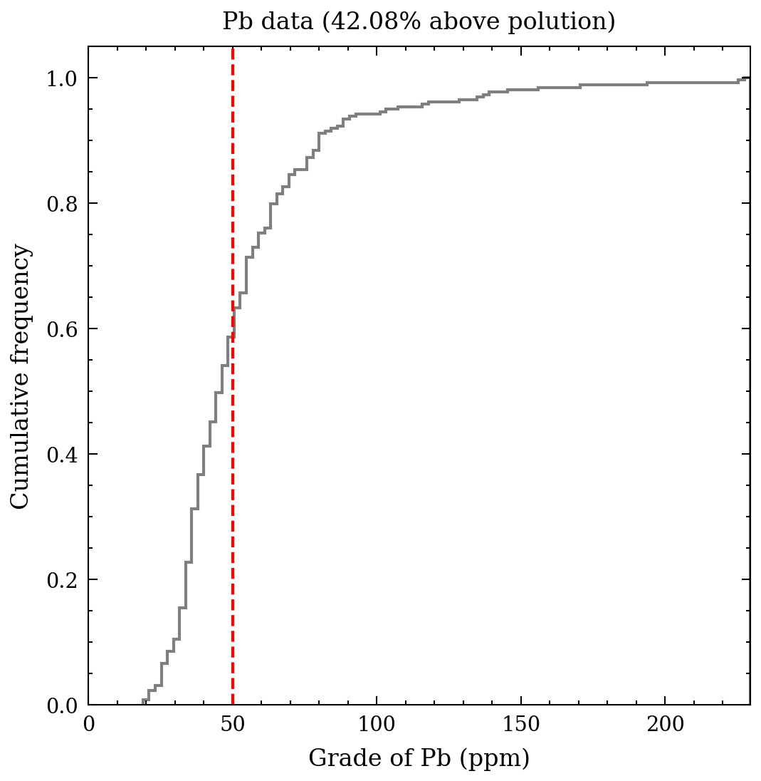 Figure 4. Cumulative histogram for lead.
Notwithstanding, this measure is not pertaining to elaborate graphics and statistics. Its purpose is to grasp the data. Initially, it is imperative to examine some of the summary statistics as a means of comprehending the data. Significant aspects of a distribution consist of its central value and measures of its dispersion and symmetry. It is feasible to record, for every metal, the average, median, standard deviation, skewness, and kurtosis. The outcomes are presented in the table beneath - it is noteworthy to observe the variance between the average and median for the values of Cd, Cu, and Pb, which possess a pronounced positive skewness.
| Cd | Cu | Pb | |
|---|---|---|---|
| Mean | 1.31 | 23.73 | 53.92 |
| Standard deviation | 0.92 | 20.71 | 29.79 |
| Minimum | 0.14 | 3.96 | 18.96 |
| 25% | 0.64 | 11.02 | 36.52 |
| 50% | 1.07 | 17.60 | 46.40 |
| 75% | 1.72 | 27.82 | 60.40 |
| Maximum | 5.13 | 166.40 | 229.56 |
| CV | 0.70 | 0.87 | 0.55 |
| Skewness | 1.51 | 2.88 | 2.91 |
After partitioning the data into multiple subsets based on rock type and land use and extracting the corresponding metal concentration distributions, the objective is to gain a deeper understanding of the connection between environmental factors and metal concentrations. To achieve this goal, it is possible to record the mean concentration for each stratigraphy and land use for each metal. Pasture soils have the highest concentration levels for all metals, whereas the lowest concentration levels are generally found in forest soils or on Argovian rocks.
Although one may hypothesize that forest is more commonly found on Argovian rocks, the preceding tables suggest that the association between these two categories is weak, with only 21% (2.70/12.72) of forest soil located on the Argovian formation. The distinction between forest and other land uses is especially significant for copper concentrations. The increased concentration levels in agricultural soil may stem from animal feed, which forests do not receive.
| Cd | Cu | Pb | ||
|---|---|---|---|---|
| Land use | Forest | 1.39 | 9.19 | 50.60 |
| Meadle | 1.06 | 25.51 | 51.95 | |
| Pasture | 2.02 | 27.14 | 61.77 | |
| Tillage | 0.96 | 22.59 | 52.59 | |
| Stratigraphy | Argovian | 1.14 | 16.38 | 41.26 |
| Kimmeridgian | 1.35 | 22.23 | 56.37 | |
| Portlandian | 1.85 | 17.27 | 48.03 | |
| Quaternary | 1.16 | 28.66 | 52.29 | |
| Sequanian | 1.50 | 27.94 | 62.95 |
Given the current metals and how they relate to each soil, we will study how they behave with each other, by studying their behaviours simultaneously.
Bivariate statistics - more information aboard
The subsequent step involves examining the relationship between pairs of metal concentrations obtained from the same locations. Let $(z_i(\alpha), z_j(\alpha), \alpha=1, …, n)$ denote the data for two continuous attributes $z_i$ and $z_j$ collected from $n$ identical locations. A scattergram (Figure 5) can be utilized to represent this data, where the components of each data pair are plotted against each other. The below scattergram exhibits the nickel and zinc values plotted against the concentrations of Cd, Cu, and Pb. The latter three metals have a correlation with zinc. Additionally, there is a positive correlation between the concentrations of cadmium and nickel.
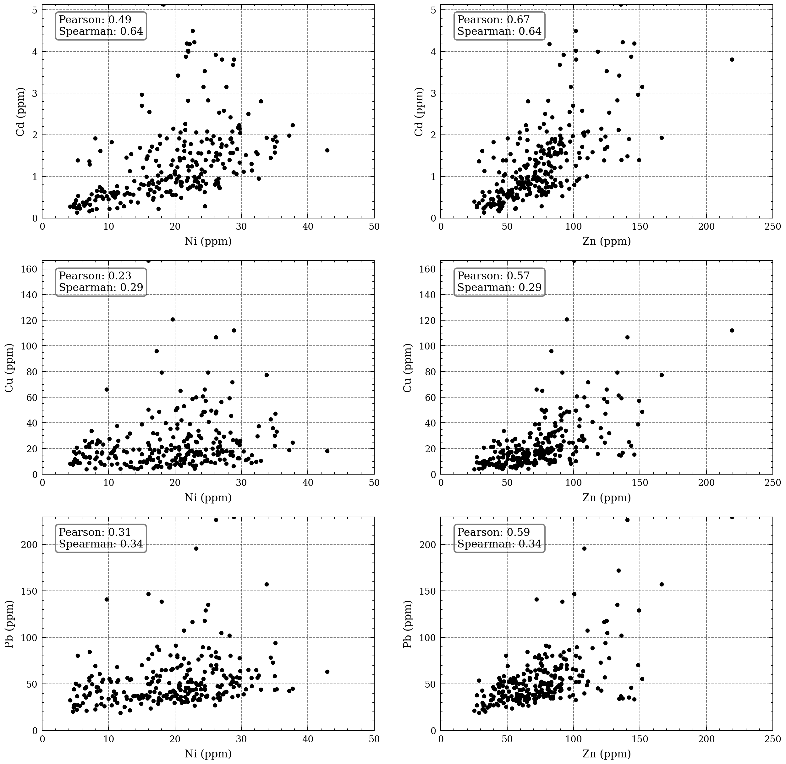 Figure 5. Scattergrams of the exhaustively sampled metalsvsthe three metals with widespread contamination.
In the context of the bivariate case, the focus is on statistics that provide a summary of the primary characteristics of the relationship between two variables. The most commonly used statistics for this purpose are the covariance and its standardized version, the linear correlation coefficient. The covariance, denoted as $\sigma_{ij}$, represents the extent of the joint variation of $Z_i$ and $Z_j$ around their respective means. Its calculation involves the following formula:
\[\sigma_{ij} = \frac{1}{n} \sum_{\alpha=1}^n (z\_i(\alpha) - \mu\_i) * (z\_j(\alpha) - \mu\_j)\]In this formula, $\mu_i$ and $\mu_j$ represent the means of $Z_i$ and $Z_j$, respectively, while $n$ denotes the sample size. The covariance becomes the variance when $i=j$. The correlation coefficient, represented as $\rho_{ij}$, is defined as:
\[\rho_{ij} = \frac{\sigma_{ij}}{\sigma\_i * \sigma\_j}\]Here, $\sigma_i$ and $\sigma_j$ stand for the standard deviations of $Z_i$ and $Z_j$, respectively. The Figure 6 gives the linear correlation coefficients computed among the seven heavy metals from the same training set. The strongest correlations ($\rho > 0.70$) are for the pairs Cu-Pb and Co-Ni.
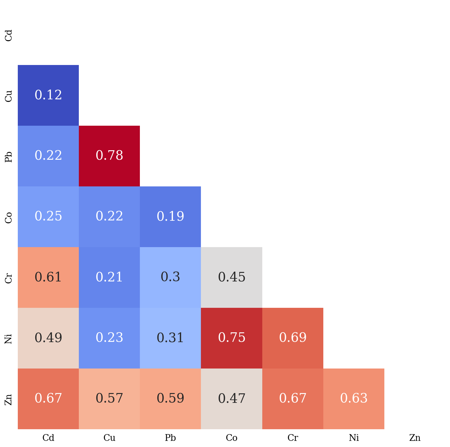 Figure 6. Matrix of linear correlation coefficients.
The scattergram provides a comparison between linear and rank correlation coefficients for heavy metal pairs. The outcomes of both measures are highly comparable, suggesting that the presence of extreme values does not significantly influence the linear correlation coefficient. This finding highlights the robustness of linear correlation coefficient in dealing with outliers. The results of this analysis can provide researchers and practitioners with a deeper understanding of the relationship between two variables and the potential impact of outliers.
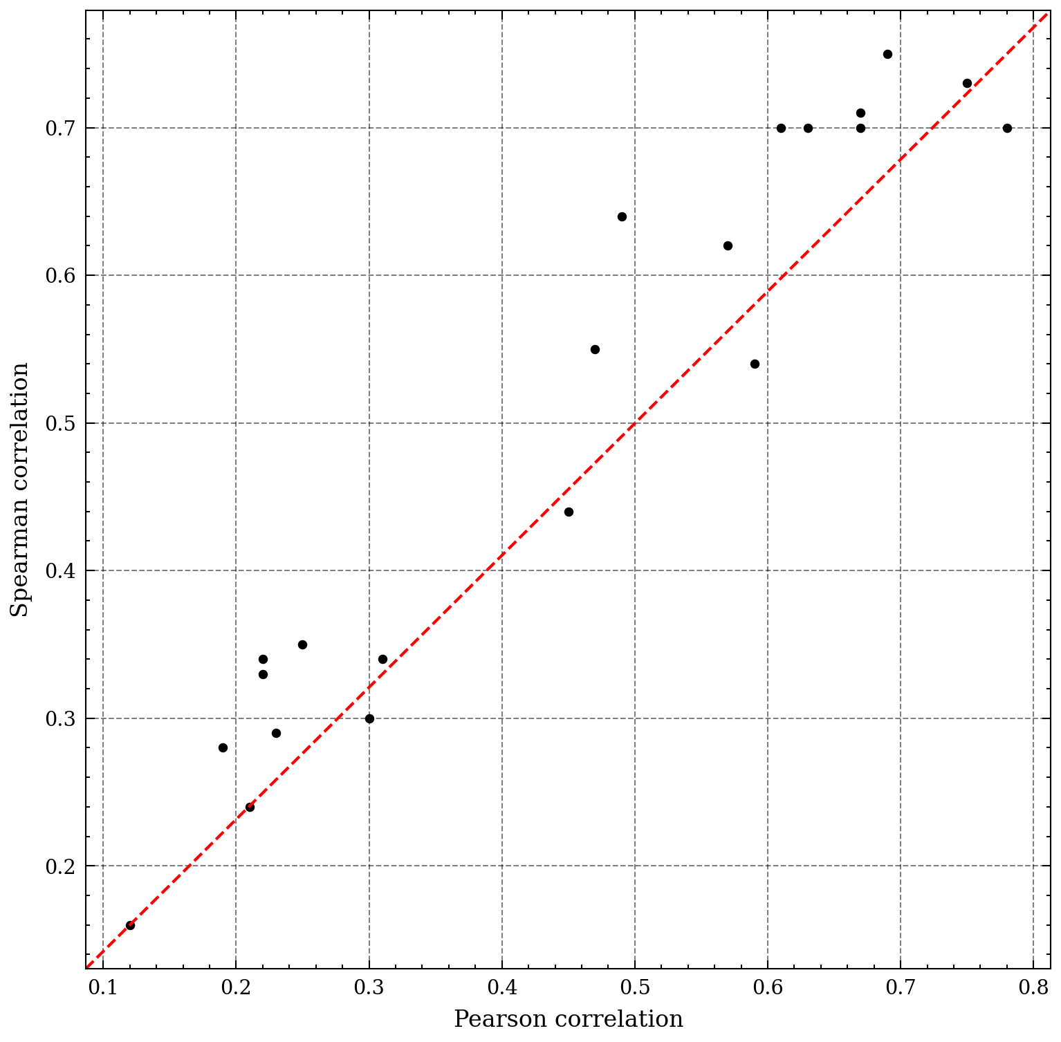 Figure 7. Scattergram comparing.
Spatial analysis
In the previous section, we have seen that the metals are correlated with each other, we also found out that many sites have a high concentration of metals - above the limited values. In the categorical map below, we can see the contaminated locations. The density of dots reflects the greater extent of contamination by cadmium and lead. The pattern of spatial distribution of contaminated sites is also informative. The red dots on the figure, are not randomized, they are clustered - such cluster could reflect potential hazards originating from the rock or man-made pollution.
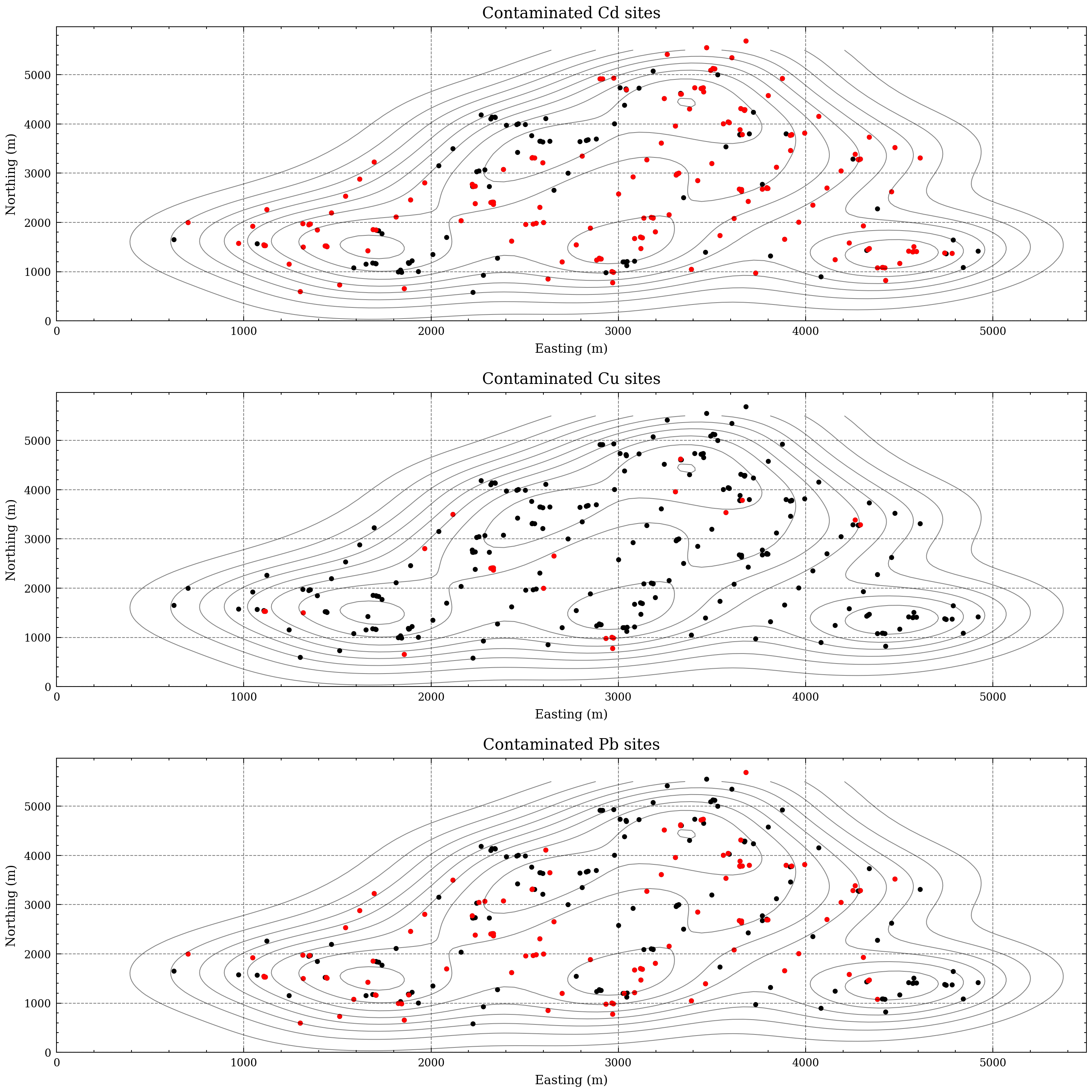 Figure 8. Categorical map of the metals.